Thursday, June 3, 2010
t y p e f a c e
The typeface I created, "Speckle," is a collaboration of small organic shapes and lines. Each letter is hand drawn and scanned into InDesign. I then edited the contrast between lights and darks and edited shapes that were out of place when viewed close up on the computer screen. I paired "Speckle" with American Typewriter Light, designed by Joel Kaden and Tony Stan, because of its curves and organic feel. The background pages are watercolor paintings edited in photoshop to represent speckle spots. This helps to push the idea of Speckle visually for the viewer's eye.

Sunday, May 9, 2010
create a typeface...


INSPIRATION!
HAND DRAWN TYPE...
here are some of examples of type that have inspired me. I have drawn a few sketches of type (i will update later) I am going for curvy, organic, thin type.
Monday, April 5, 2010
grid posters!
 for my next poster i decided to do mason jennings. the layout for this one involves the grid system, which seems like it may be a little complicated. these posters i chose (for inspiration and because they attracted my eye) don't necessarily have great grid systems but i want to use their hand drawn/analogue style. they are awesome.


Sunday, March 7, 2010


Monday, March 1, 2010
i need help!
I used watercolor and scanned in a few images to my computer then combined and worked with them in photoshop. What I didn't realize was that the paper size in photoshop was Letter size so when I placed my final image into InDesign, the image was too small. When i scaled it to the 11 x 17 size, my image became completely blurry. I spent so much time on it, i don't know what to do! Any suggestions?
i n s p i r a t i o n.


next poster = slightly stoopid. in the process of being made but here is some GREAT inspiration. these are the winning posters for the triple crown of surfing competition. i love all of them..however, these are just a few.
Subscribe to:
Posts (Atom)
Surfing-my sister

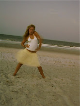
I love this picture because it reminds me of this past summer surfing with my sister. We took a bunch of creative pictures one day on the beach and i ended up liking this one alot. I love how the picture is in sepia tone, it is probably my favorite coloring for pictures.